A Trip Down Random Access Memory Lane
Over the last 10+ years or so, one of my hobbies has been to periodically break my website, panic, and then build a new and/or improved version. Naturally, I could avoid the first two steps of this cycle through some relatively simple quality assurance measures, but I am the only person who routinely visits the site and I also get a big kick out of flying by the seat of my pants, forging boldly—often irreversibly—into the unknown!
I thought it might be fun to take a look back at previous incarnations of my website(s) to share what I’ve learned. On the scale of nothing to everything, it’s closer to the former!
Table of Contents
The Prequel: Myspace
When I first started the band in the early-mid-2000s, I did what everyone else was doing and created a Myspace page. Modifying this profile page was the first time I started investigating how HTML works. This was largely done through trial and error, copying and pasting various snippets of cryptic code from dubious sources promising to FULLY CUSTOMIZE YOUR MYSPACE PROFILE. Through this process, some rudimentary understanding of the basics crystalized. This time period is also most certainly where I developed my affinity for questionable design choices! Fortunately for everyone, no screenshots of this page have survived.
thebenjamen.com 1.0
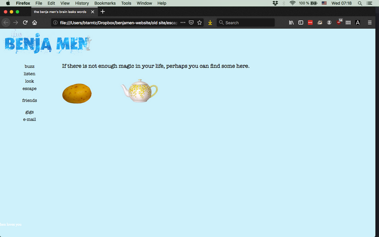
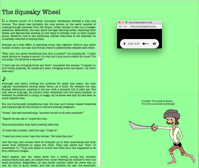
Around 2009 or so, I had some free time on my hands, so I purchased the domain thebenjamen.com. I spent more time than I wanted to wading through documentation about html, css, ftp clients, nameservers, and more stuff that felt way too complicated. At that point in time, I didn’t want all the hassle of doing everything by myself, so I downloaded the open-source WYSIWYG editor KompoZer along with some open-source CSS-for-dummies editor I can no longer find. Using these tools, I created my first Terrible Website. One of the pages had the INNOVATIVE potato and teacup-based navigation you see above. This is a feature I think should definitely be resurrected in the future!
All Blogged Up: The Benja Tumblr
I jumped on the online handle "The Benja Men" pretty early and claimed it across a fairly wide range of social media and creative platforms, even ones I don’t really use or even like (looking at you, Facebook, Twitter, & Instagram). YouTube is the notable exception; deffo dropped the ball on that one. There also appears to be some kind of philanthropy group operating out of Jackson, Michigan under thebenjamen.org, but I digress!
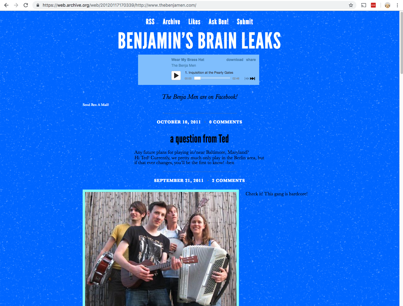
Around 2012, I thought it might be better to have a blog-like website, so that I would be more inclined to update it regularly. I already had the name thebenjamen on tumblr, so I set up an eye-sore of a blog, sweated my way through a few DNS setting changes, and presto—thebenjamen.com was now a tumblr. If I knew what I was doing at the time, I would have made a blog subdomain and just set that to the tumblr, but I think we have already established my preference for learning things the hard way! Eventually I moved my website off of tumblr, but I didn’t delete the posts i made there. It is still there, a ghost of my internet past!
Making Pals with Drupal
After tumbling blindly for a while, I realized that my brilliant idea to point my domain to tumblr was actually a huge mistake. Not only did the website contain little to no information about our band, I still wasn’t using it very much, and it looked like the inside of one of those squishy blue tube toys. I definitely could have addressed all these issues within tumblr with fairly minimal effort, but my brainworm decided it was way more logical to redo the whole website. In a poor decision that would haunt me for quite some time, I developed and then published this new version of the site on a subdomain and redirected the main domain to it.
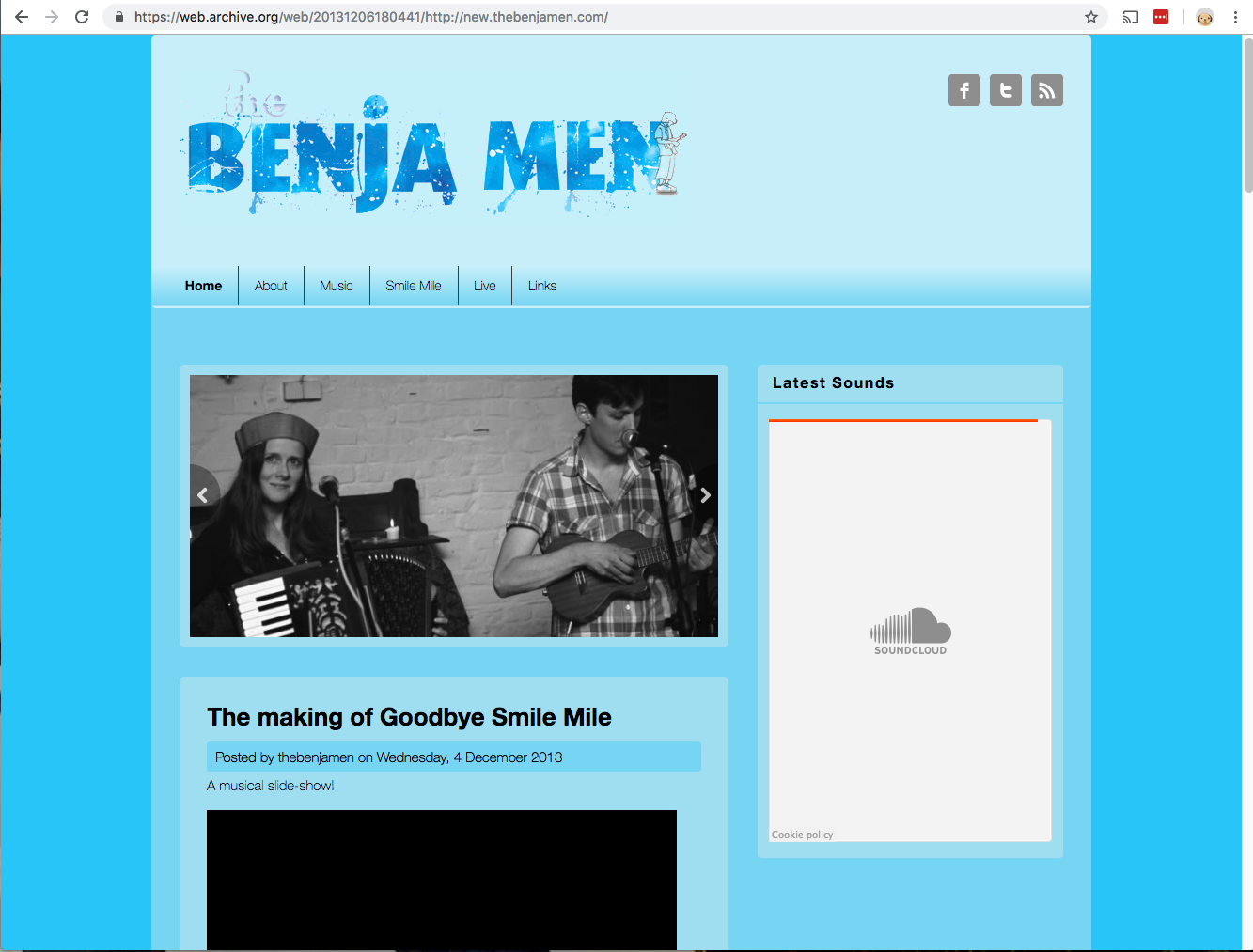
With the wisdom of my advanced age, I can now safely say that this is not a practice I would recommend. It created a lot of headaches down the line when I wanted to move everything back to the main domain. Lesson learned: develop locally, test on password protected subdomain, and then publish to the main domain.
The Next Sub-Mistake
At some point later in time, I got a bug up my ass about wanting to write more. Having completely forgotten the existence of my tumblr page, I created the new subdomain blog.thebenjamen.com and installed Wordpress on it. You might think it is difficult to screw this up because my hosting does that with the click of a button, but I found a way by failing to install it to the root directory. In the end, the blog was not actually at blog.thebenjamen.com, but blog.thebenjamen.com/wordsalad/. In my haste to write, I overlooked this fact for an embarrassingly long time--noticing only many blog posts later, when I had already started sharing links to the blog. At that point, it was kind of too late to change.
I am not sure why I didn’t stick with Drupal; I think I just wanted to try something new. I got accustomed to Wordpress, and I was actually making pretty regular entries for once. The only problem was that it the page was incredibly slow to load. Right now, I’d say the odds are pretty square it is because of something I configured incorrectly or a result of my 2009 self’s uninformed hosting choices. I will occasionally try to fix the slow loading, with results ranging from completely breaking the website to marginal improvement. There are no screenshots, The Wayback Machine seems to have only logged server errors (fitting!). This is why I would eventually replace wordpress with Publii (years later), which is what you see now!
Wordpress for Everything! You Get a Wordpress! And You Get a Wordpress!
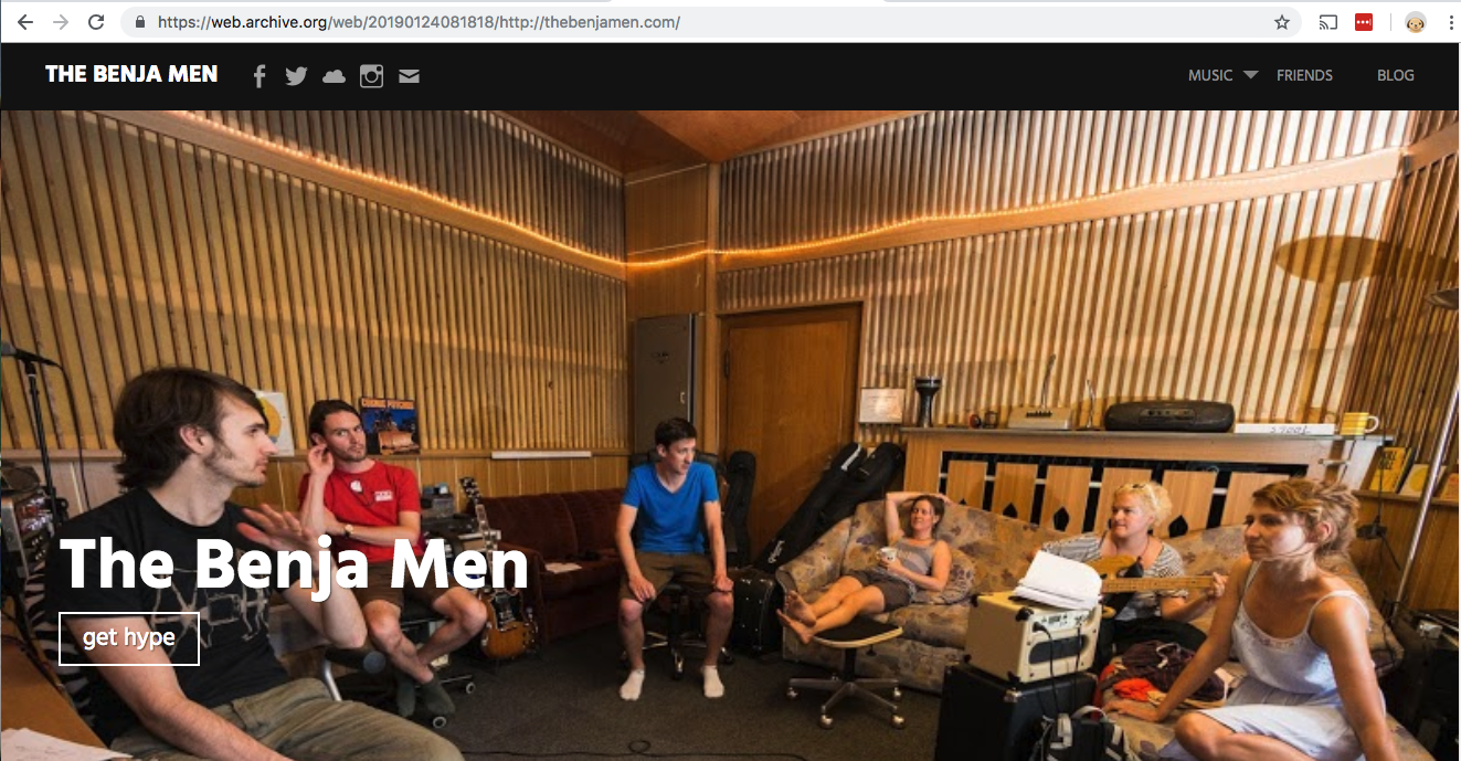
For the next incarnation of my website, I decided to use Wordpress again. Since Wordpress simplifies everything, this page had a pretty clean look to it, and everything just worked. Except sometimes the whole site. There were a lot of mysterious 500 errors that required disabling plugins and reactivating them one by one, reinstalling the Wordpress core (because attempting to update it was also causing the server error), emptying caches, etc. Many sources suggested my hosting is less than ideal for Wordpress. Cool. Wish I'd read up on that before changing everything. As if! Eventually, I was spending more time simply getting the site to work than I was creating content for it. And it was slower than molasses in pre-global-warming Siberia. And then, after recently reading McSweeney’s The End of Trust, I decided to add an SSL certificate through Let’s Encrypt. Configuring this exponentially increased the rate of mysterious 500s. I was fed up!
Picking the Site up by the Bootstrap
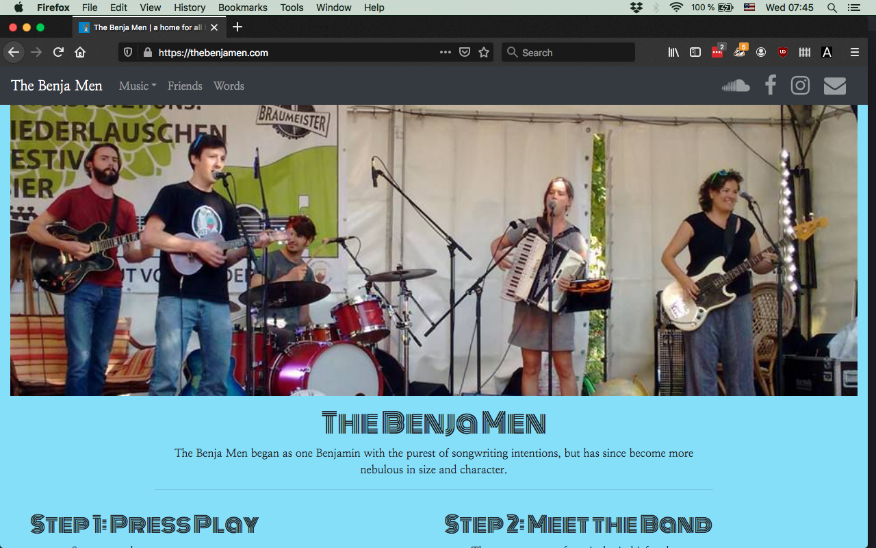
Coming full circle, I decided to make a static website that I would upload via FTP, this time with slightly more of a clue what I'm doing. On this go around, the goal was for the site to load quickly, be responsive, and to be done ASAP since the current Wordpress site was a fickle and uncooperative beast. I decided to use Bootstrap for a number of reasons: I have used it before (at my last jobby job), it is incredibly easy, and many (if not most) people already have it cached in their browser. So I made the relatively simple site that's now live, taking most of the design cues from the Wordpress site. I really enjoyed doing it this way, no CMS, just me and VSCode.
Side Projects
While this long and probably not terribly exciting article has been all about my band website, I also tinker around building other stuff just for fun.
The Hate Machine - A single purpose robot that hates everything! It has some flashing lights, so if you are photosensitive, please just listen to the song version instead:
Greenskies - I don't really enjoy spending time on most social media sites, so this is sort of my ersatz Instagram.
TL;DR - I can't wait to bork one or more of my websites again soon!

